UX/UI case study · Website · Team project

Shelflyon the web

“Books brought us here. Conversations keep us going.”

The desktop side of Shelfly: a website where readers set up their shelf, discover their next book with smart filters, and join a community of people who read like they do.

My role
UX/UI Designer
Duration
Three months, part-time
Team
5 designers, concept by UXland mentors
Tools
Figma, FigJam, Lyssna, Maze, Canva, Google Forms

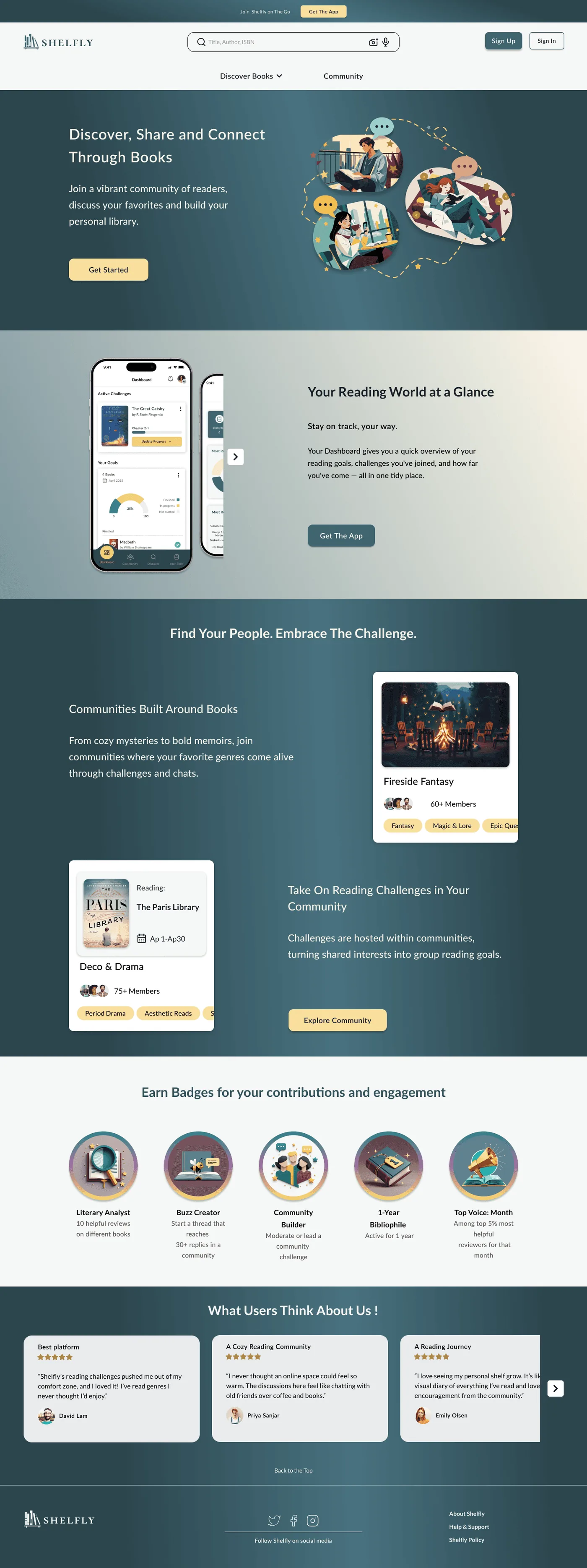
Shelfly's homepage on a desktop monitor: Discover, share and connect through books
i.
Overview

One place for your shelf, your goals and your people

Shelfly is a book discovery and tracking platform that helps readers organize their reading, set goals, and engage with a community through shared interests and discussions. The concept was defined by UXland mentors around a real problem in the reading and book-tracking space; my team researched and designed the end-to-end experience.

The problem

Readers struggle to organize their reading, track progress and stay motivated, because their tools are fragmented and rarely social. Existing platforms focus either on tracking or on community, so managing a reading life in one clear place is hard.

Shelfly also has a mobile app. See the Shelfly App case study →

An all-in-one, friendly platform to organize books, track progress, and stay motivated through community and challenges.

My responsibilities
  • UX research, including surveys and analysis of user needs
  • Defining the product structure and core features
  • Personas, scenarios and user flows
  • Low- and high-fidelity wireframes
  • Interaction design and visual UI decisions
  • Usability testing and design iteration
Team
Mitra JavadiKimiya SadjadianMojtaba RahimiYasaman AhmadiYasaman Safari
Process · Double Diamond, from a general problem statement to a specific solution
ii.
Research

What readers need from a desktop experience

Early research to find pain points, test assumptions and shape every decision that followed.

1Competitive analysis
2Survey & interviews
3Affinity diagram
4Card sorting
5Persona & scenario

Six core desktop tasks

From the research and product goals, we defined the tasks the website had to support well.

Account creation & onboarding
Personalization setup
Managing the personal shelf
Discovering new books
Filtering & browsing content
Engaging with books

Competitive analysis

We compared reading and community platforms to understand industry standards and find where Shelfly could do better, in both experience and visual design.

Goodreads

Strong community and book tracking, but no modern AI features.

StoryGraph

Excels at AI-powered recommendations and tracking.

LibraryThing

A niche collector's tool with strong library integrations.

Fable

Shines in social features, gamification and interactive reading clubs.

Reddit & Discord

The most interactive communities, but no structured book tracking.

TikTok #BookTok

Dominates viral recommendations, but isn't built for tracking or discussion.

Tertulia

Blends discovery with shopping, unique for commerce-driven readers.

The opportunity

None of them combine structured tracking, personal discovery and community in one calm, organized space.

Feature matrix · personalization, community, gamification, tracking, live features, AI recommendations, integrations, business model

Survey & interviews

Surveys and interviews gave us direct feedback and qualitative insight to confirm or challenge our early assumptions.

64.5%choose what to read from friends' recommendations
61.3%rely on online book reviews
54.8%would use a mood-based recommendation system
41.9%track reading by marking books “currently reading” or “finished”

Shelfly Platform Survey, 31 responses per question shown.

The survey
Interview guide

Affinity diagram

Every insight, clustered, to find the patterns behind what readers told us.

Reading frequencyFinding the right bookToo many choicesDistractionsMood & feelingsDiscussions with friendsRecommendation styleFilteringDescription previewsGamification & badgesOnline discussionsProfile customizationTracking

Scroll sideways · tap any board to enlarge

Card sorting

A card sort showed how users naturally group Shelfly's content. It refined the site's structure and led to a clearer, more intuitive sitemap.

User A
User B

Persona: Mia Carter

From the surveys, interviews and card sort we built one persona to keep real needs, goals and behaviors at the center of every decision: a graduate student in Vancouver who loves reading, wants personal recommendations, and looks for a place to talk about books.

iii.
Scenario & final design

Mia signs up and finds her next book

The scenario connects the research to the screens. Pick a step, then scroll inside the browser window.

shelfly.com
Shelfly homepage

Scroll inside the window to see the whole page ·

iv.
Ideation & visual direction

Sketch fast, then set the mood

Sketches tested structure; the mood board and UI kit set a warm, bookish tone shared with the app.

With users, goals and the scenario clear, we sketched early layouts. Low-fidelity sketches let us explore page structure, content placement and interactions quickly, and turn research into design directions before wireframing.

Homepage
Book page
Discover and You pages
Mood board
UI kit
v.
Wireframes to hi-fi

Four rounds of refinement

We made four versions of the wireframes across mid and high fidelity, improving structure, layout and clarity each time. The final round became the high-fidelity pages below.

Homepage
Onboarding
Onboarding summary
You page
Discover
Search results

Scroll sideways · tap a page to see it in full