UX/UI case study · Mobile app · Team project

Shelfly

“Books brought us here. Conversations keep us going.”

A mobile app that brings reading progress, community challenges and book discussions together, so readers stay motivated and find people who love the same books.

My role
UX/UI Designer
Duration
Three months, part-time
Team
5 designers, concept by UXland mentors
Tools
Figma, FigJam, Lyssna, Maze, Canva, Google Forms
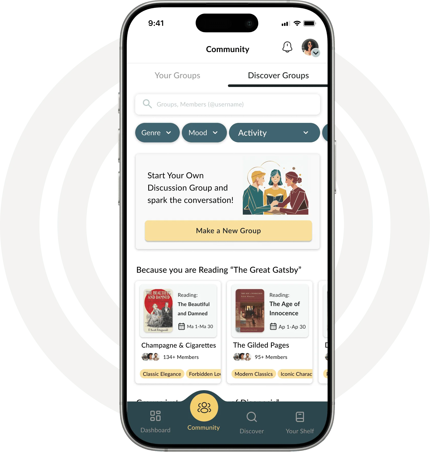
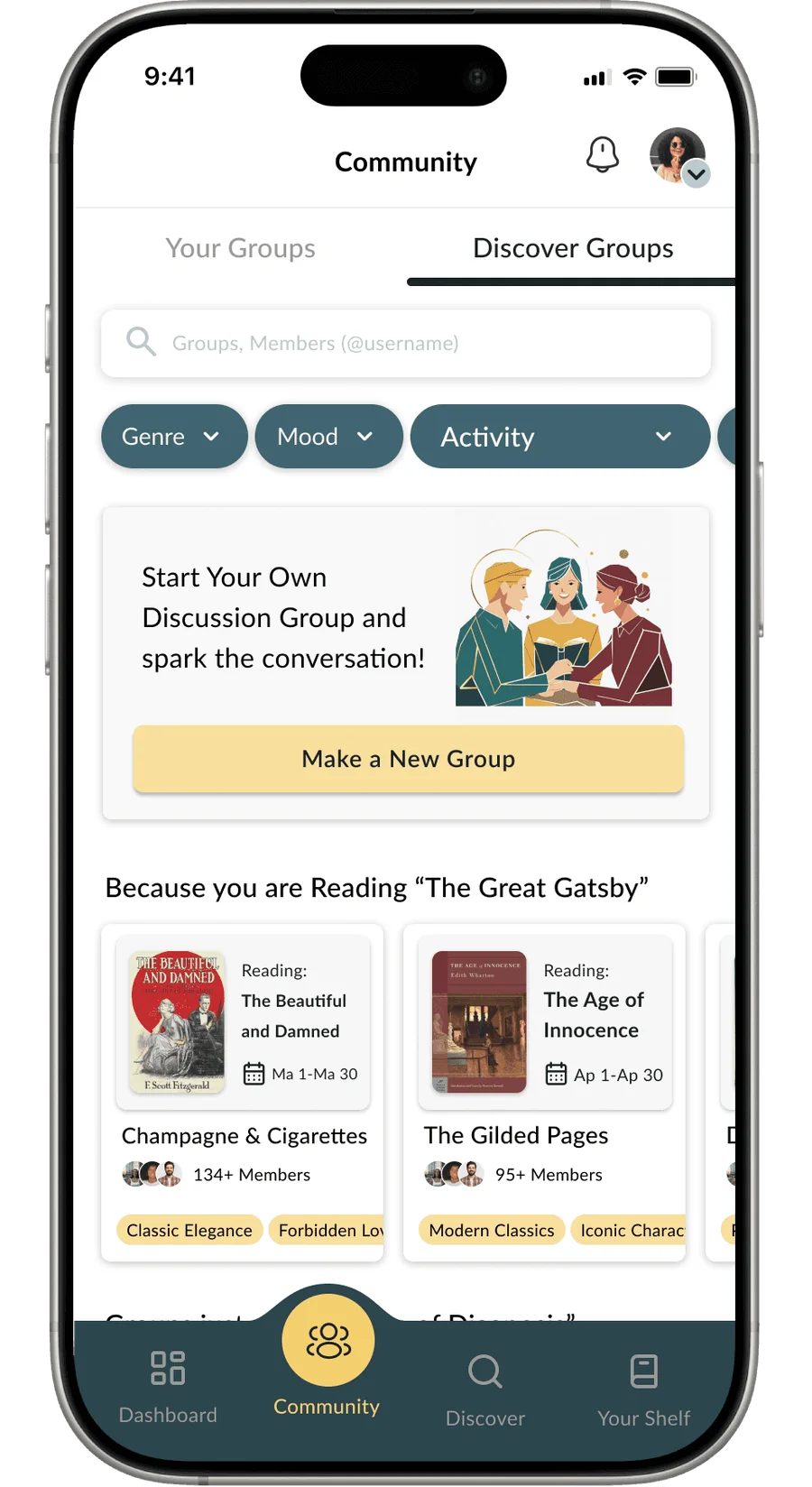
Shelfly's Community screen on a phone: discover groups, start your own discussion group, and groups for books you are reading
i.
Overview

Reading is personal. Staying motivated is social.

Shelfly is a book discovery and tracking platform that helps readers organize their reading, set goals, and join a community through shared challenges and discussions. The product concept was defined by UXland mentors around a real problem in the reading and book-tracking space. My team owned the full UX/UI process, from discovery to a tested, iterated hi-fi prototype.

The problem

Most reading apps track books but don't create engagement beyond basic progress updates. Readers struggle to stay motivated, connect with other readers, and find challenges that fit their habits. Without personal insights, social interaction and good recommendations, reading feels isolated, and long-term goals slip.

Design a mobile app that brings reading progress, community challenges and social interaction together in one place.

The goal: help readers stay motivated, track what matters to them, and engage with people who share their interests.

My responsibilities
  • UX research, including surveys and analysis of user needs
  • Defining the product structure and core features
  • Personas, scenarios and user flows
  • Low- and high-fidelity wireframes
  • Interaction design and visual UI decisions
  • Usability testing and design iteration
Team
Mitra JavadiKimiya SadjadianMojtaba RahimiYasaman AhmadiYasaman Safari
Shelfly also has a desktop website. See the Shelfly Website case study →
Process · Double Diamond, from a general problem statement to a specific solution
ii.
Research

Grounding the design in how people really read

Five research steps, each one sharpening what readers need from a platform like Shelfly.

1Competitive analysis
2Survey & interviews
3Affinity diagram
4Card sorting
5Persona & scenario

Competitive analysis

We compared reading and community platforms to see where existing products succeed and where they fall short.

Goodreads

Strong community and tracking, but feels outdated and lacks personalization.

StoryGraph

Excellent AI-powered recommendations, limited social features.

Fable

Leads in gamification and interactive reading clubs. Closest to Shelfly's vision.

Reddit & Discord

The richest community discussions, but no reading structure.

The gap

No platform combined structured reading tracking, challenge-based motivation and meaningful discussion in one experience. That became Shelfly's opportunity.

Feature matrix · personalization, community, gamification, tracking, live features, AI recommendations, integrations, business model

Survey & interviews

We ran an online survey and follow-up interviews to test our assumptions about motivation, social connection and how people track their reading.

64.5%choose what to read from friends' recommendations
58.1%want to see what friends are reading and their reviews
54.8%would use a mood-based recommendation system
35.5%don't want tracking features at all, so tracking had to stay light

Shelfly Platform Survey, 31 responses per question shown.

The survey
Interview guide · finding books, motivation, challenges, gamification

Affinity diagram

We clustered every survey and interview insight to find the patterns behind them.

Reading frequencyStruggles finding the right bookToo many choicesDistractionsMood & feelingsDiscussions with friendsRecommendation styleBy favorite authorBy friends' choicesBy similar booksBy moodFilteringDescription previewsGamification & badgesOnline discussionsProfile customizationTracking

Scroll sideways · tap any board to enlarge

Card sorting

We asked users to group Shelfly's content the way they'd expect to find it. They separated personal tracking (goals, progress, stats) from community content (discussions, challenges, groups) every time.

That split became the bottom navigation: separate Dashboard and Community sections.

User A
User B

Persona

Our synthesis pointed to one primary user: a motivated reader who wants to stay accountable to her goals, connect with others over shared books, and discover new reads through trusted community recommendations, not algorithms alone.

  • Wants to organize her shelf and track progress without effort
  • Finds personalized recommendations hard to come by
  • Has few ways to join meaningful book discussions
iii.
Scenario & final design

One evening with Shelfly, step by step

The scenario we wrote from the persona became the backbone of the app. Step through it on the phone.

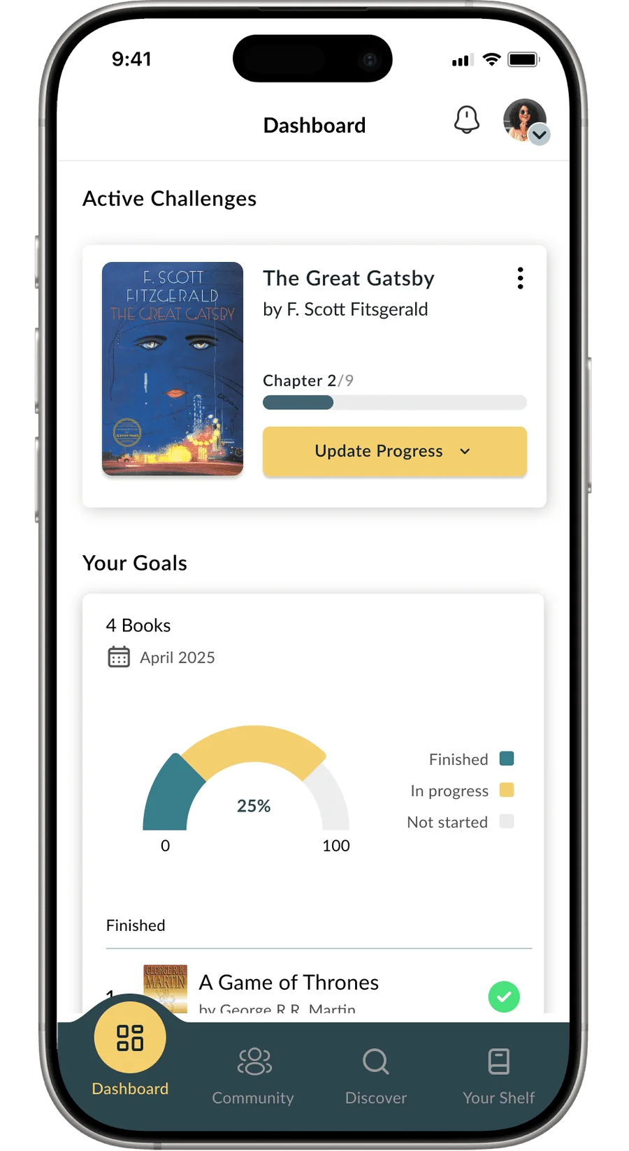
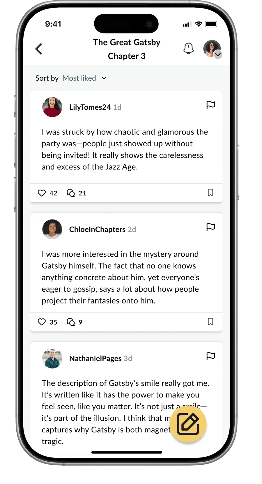
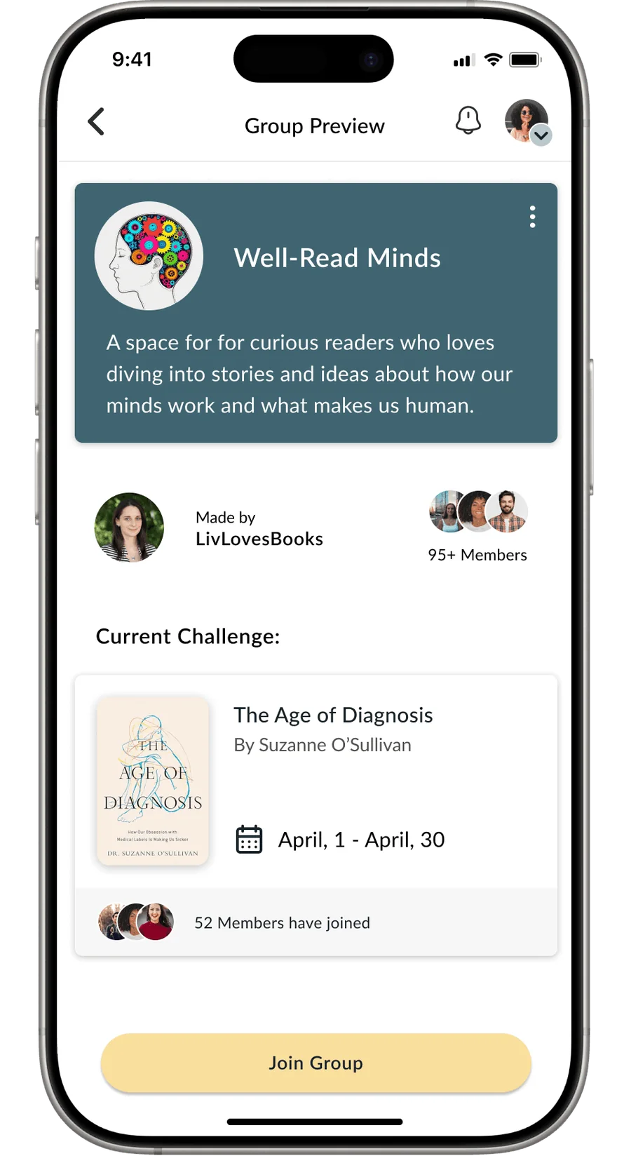
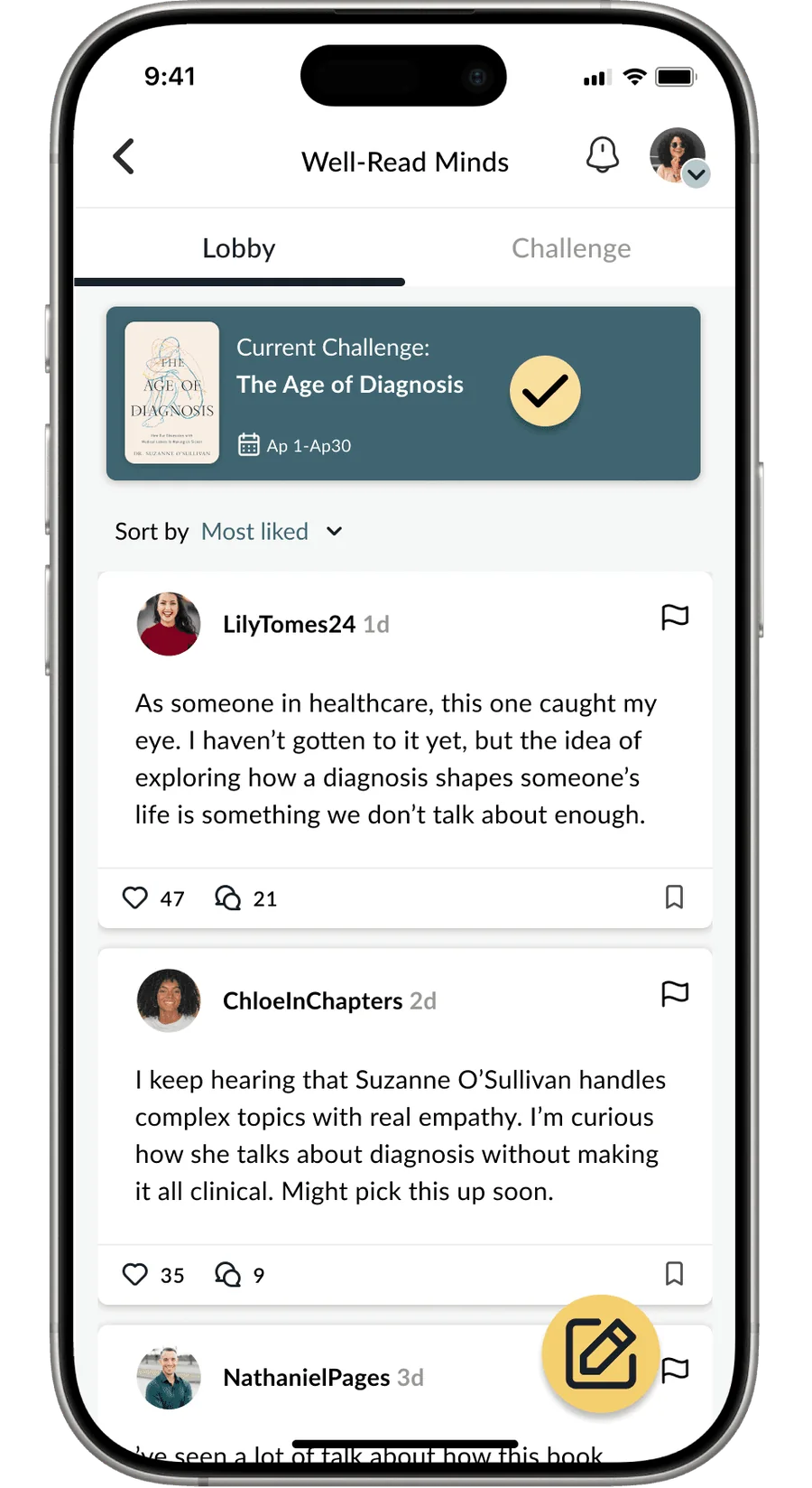
Dashboard with active challenge, reading goal chart and finished books Chapter 3 discussion for The Great Gatsby with reader comments Community, Discover Groups tab with filters and suggested groups Group preview for Well-Read Minds with current challenge The Age of Diagnosis Group lobby after joining the challenge, with a check mark on the current challenge

Dashboard

iv.
Ideation & visual direction

From paper to a warm, bookish interface

Sketches explored structure fast; the mood board and UI kit set the tone before we committed to screens.

With the users, goals and scenario clear, we sketched layouts for the homepage, profile, community, browse and group-discussion screens. Low-fidelity sketches let us test structure, content placement and interactions quickly before moving into wireframes.

Sketches · homepage, profile, community
Sketches · browse and group discussions
Mid-fidelity wireframes · the discussion flow
Mood board · cosy libraries, deep teal and warm gold
UI kit · color scales, button states, type, components
v.
Usability testing & iterations

Four rounds, targeted changes

We tested every iteration and changed only what the evidence pointed to.

Think-aloud sessionsPreference testsFirst-click testsWCAG review
Iteration 1 → 2
  • Goodreads import during onboarding as an alternative to manual entry. Users who used to abandon onboarding finished it. +40% onboarding engagement
  • “Skip” and “Set reading goal” made easier to see and reach, after users kept missing them.
  • Progress shown in a more visual, encouraging format. Users called the old linear bar “boring.”
Iteration 2 → 3
  • Removed a second homepage after sign-in and sent users straight to their dashboard. −25% confusion
  • Renamed navigation from “Stats, Bookshelves, Discussion Groups” to “Dashboard, Discover, Community,” based on preference tests.
  • One summary screen replaced several onboarding review screens, plus a completion badge.
  • Two curated lists in Discover (“Week's most popular”, “Top rated”) after users felt overwhelmed by choice.
Iteration 3 → 4
  • Accessibility: applied WCAG guidelines across every screen: color contrast, touch-target sizes and type hierarchy.
  • Polish: final visual refinements for consistency across the whole app.
vi.
Final screens

The tested hi-fi design

Scroll sideways; tap a screen to enlarge it.

Dashboard
Chapter discussion
Your groups
Discover groups
Group preview
Joined the group
Group lobby
Challenge joined
Members' progress