UX/UI case study · Mobile app redesign · Solo project

Toronto Cupcake

Fresh daily cupcakes, now easy to order from a phone.

A Toronto bakery with seasonal flavours, custom designs and GTA-wide delivery. Its website made product details, allergens and ordering hard to get through, so I redesigned the experience as a mobile app.

My role
Solo UX/UI Designer
Duration
One month, part-time
Context
BCIT coursework
Tools
Figma, FigJam, Lyssna, Canva
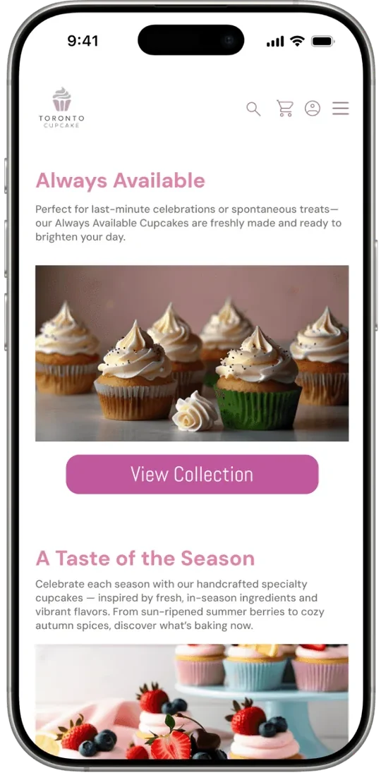
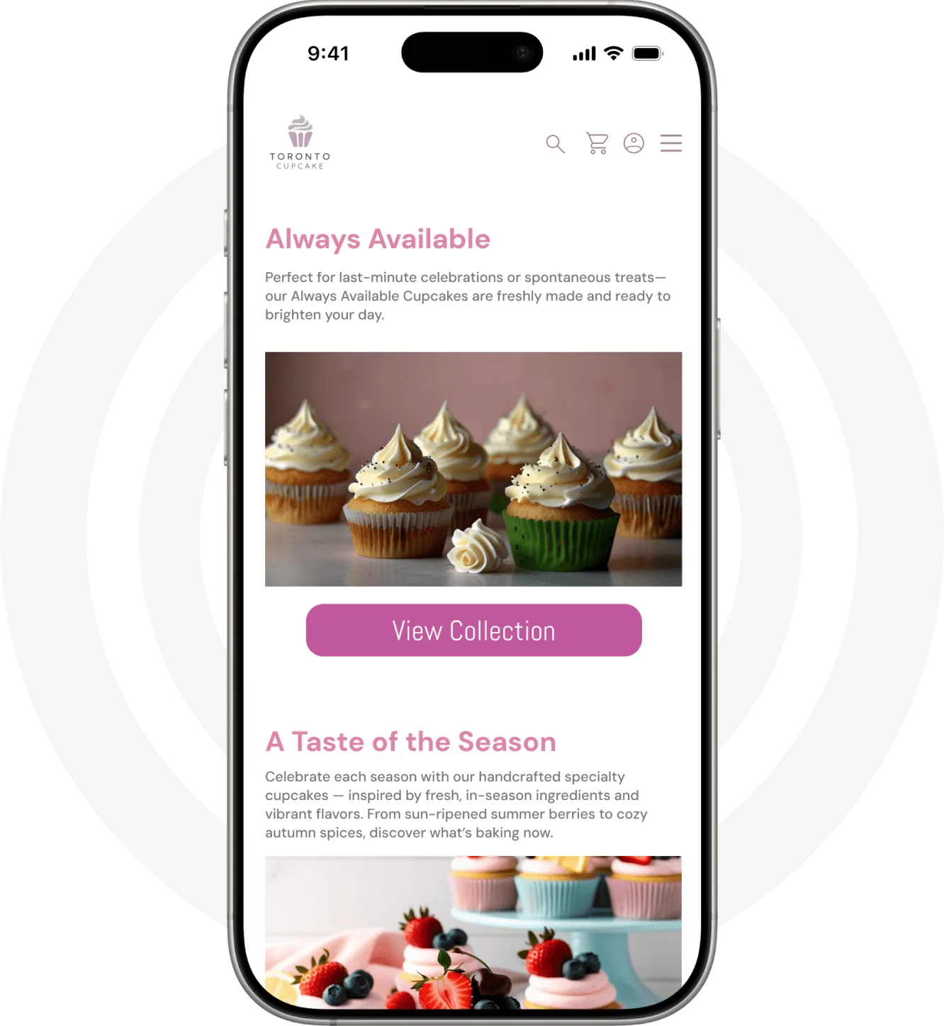
The redesigned Toronto Cupcake home screen on a phone: Always Available cupcakes and A Taste of the Season
i.
Overview

Lovely cupcakes, hard to order

The problem

Visitors struggled with a cluttered layout, inconsistent visual hierarchy and unclear key information: flavour descriptions, allergen details and delivery options. Every one of these moments chipped away at confidence and made ordering harder than it should be.

Make browsing, understanding and ordering cupcakes feel effortless, with a look that matches the bakery's warmth.

The goal: a mobile app with clear product information, a streamlined checkout, and a visual identity worthy of the brand's quality.

My responsibilities
  • Reviewed the current site and identified key UX issues
  • Researched competitors and user expectations
  • Created user flows, wireframes and final UI designs
  • Built interactive prototypes in Figma
  • Ran usability tests and refined the design from the feedback
Design process
EmpathizeHeuristic review, competitors, persona
DefineUser journey and opportunities
IdeateLo-fi wireframes and structure
PrototypeStyle guide and hi-fi screens
TestUsability tests, then iteration
ii.
User research

Where the old site let people down

Three methods to ground the redesign in real needs.

1Heuristic evaluation
2Competitive analysis
3User persona & tasks

Heuristic evaluation

Before any testing, I reviewed the existing site against usability heuristics to find the friction points.

Poor visual hierarchyCluttered, outdated layoutHard-to-find allergen informationConfusing ordering stepsInconsistent spacing

Competitive analysis

I compared Toronto Cupcake with two competitors to see how strong bakery and food e-commerce sites present products, handle allergens and structure checkout.

FeatureTorontoCupcake.comSullivansbleeker.comthecupcakeshoppe.ca
Mobile experienceCramped, long scrollsResponsive but basicCrowded, small text
Information architectureKey info buriedClear but overwhelmingDisorganized structure
Navigation clarityConfusing, unclear categoriesMany categories, easy to scanBusy, harder to navigate
Product presentationBad photos, inconsistent layoutClean grid, strong photosMixed-quality images
Typography & readabilitySmall, inconsistentClean and consistentHard to read, crowded
StrongMixedWeak

User persona

From the research I built a persona for the bakery's core customer: a busy parent who orders for celebrations and needs to trust what's in every cupcake.

Portrait photo used for the persona Emily Parker
Persona

Emily Parker

A 35-year-old working mom with two young kids. Her days are a balance of work, school drop-offs and family activities, so she values anything that saves time and reduces stress. She often orders treats for birthdays, school events and family celebrations, and needs a bakery she can trust for safe ingredients, clear information and reliable delivery. She prefers simple, fast online experiences that make decisions easy.

Goals

  • Find cupcakes quickly, without cluttered pages
  • Trust that ingredients are safe, especially for nuts, allergies and dietary needs
  • See clear pricing
  • Decide fast from appealing photos
  • Finish ordering without confusion or extra steps

Frustrations

  • Hard-to-find allergen information
  • Unclear delivery options or scheduling
  • Slow or cluttered mobile experiences

Motivations

Easy ordering Clear info Quality Price Saving time

Preferred device

Phone Computer
iii.
User journey

Emily orders for a peanut-allergic child

Eight stages from a Google search to a booked delivery. The curve tracks how she feels; the one dip is where the design had to change.

happyfrustrated
01AwarenessSearches “cupcake shops in Toronto” on Google.I need something safe for my peanut-allergic child.Hopeful, cautiousHighlight allergen safety in search results.
02DiscoveryClicks through to the Toronto Cupcake site.The site looks good so far.CuriousStrong hero images and clear navigation.
03ExplorationBrowses categories and product pages.The photos and allergen info are very helpful.Impressed, reassuredKeep visuals strong; make allergen info prominent.
04Product selectionAdds 1 peanut butter, 5 chocolate chocolate, 2 vanilla vanilla.This is exactly what I need.Confident, satisfiedEasy quantity editing and concise descriptions.
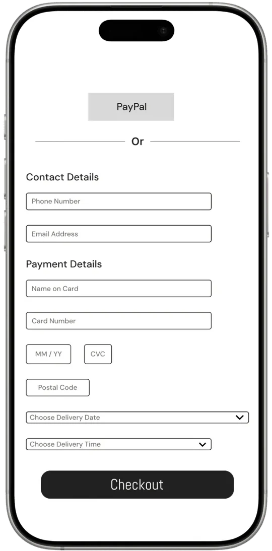
05Checkout attemptClicks Checkout; a pop-up requires login or sign-up.Ugh, I don't have an account yet.Mild frustrationOffer guest checkout to reduce friction.
06Account creationCreates a new account and continues.At least this was quick.NeutralKeep sign-up short and simple.
07CheckoutPays by credit card; picks delivery on June 12, 2–5 PM.This is easy and convenient.Confident, relievedClear delivery scheduling and a secure payment UI.
08ConfirmationLands on a success page; gets an email confirmation.Perfect, everything is booked.Satisfied, reassuredAdd an order tracking page for transparency.
Scroll sideways on small screens

iv.
From wireframe to app

The ordering flow, step by step

Pick a step, then switch between the lo-fi wireframe and the final hi-fi screen.

Hi-fi home screen

Hi-fi · Home

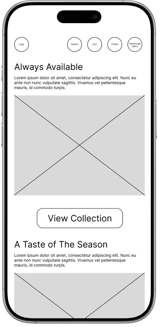
Lo-fi wireframes

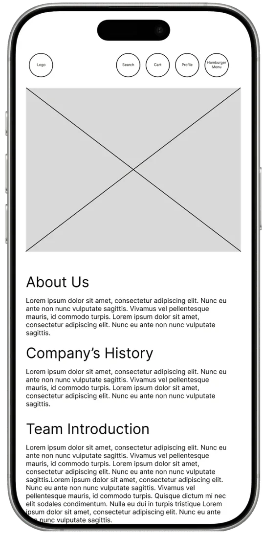
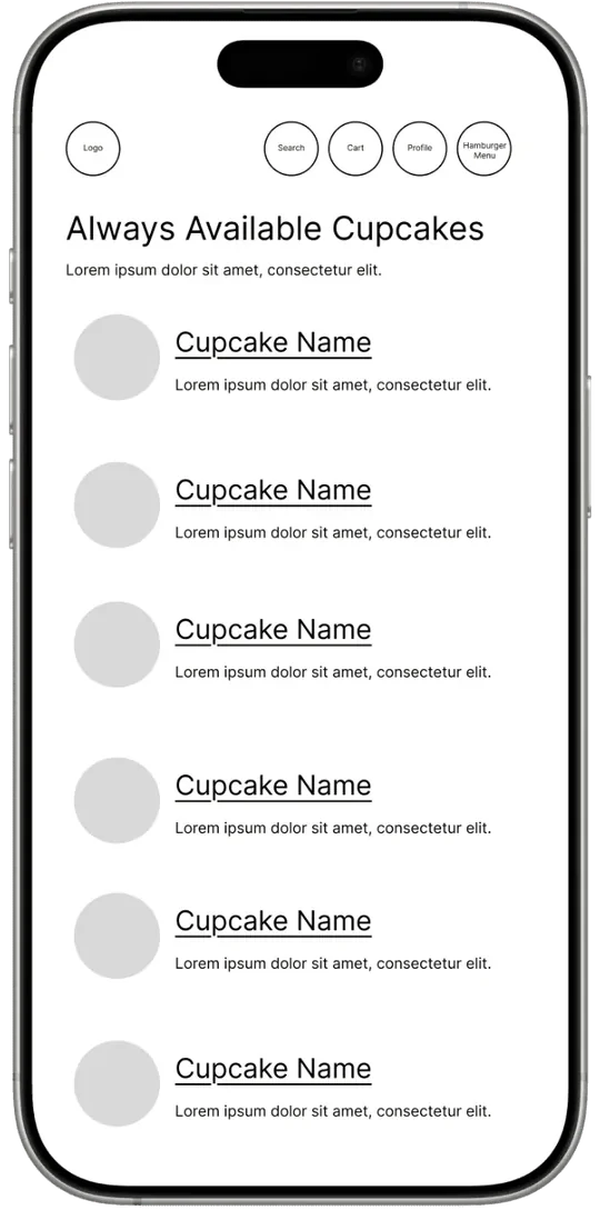
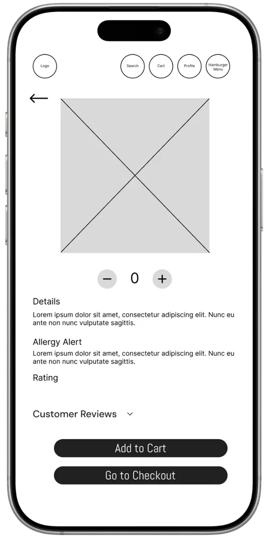
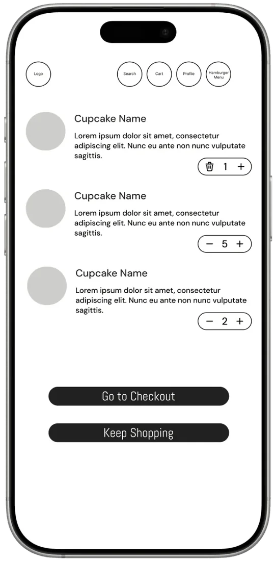
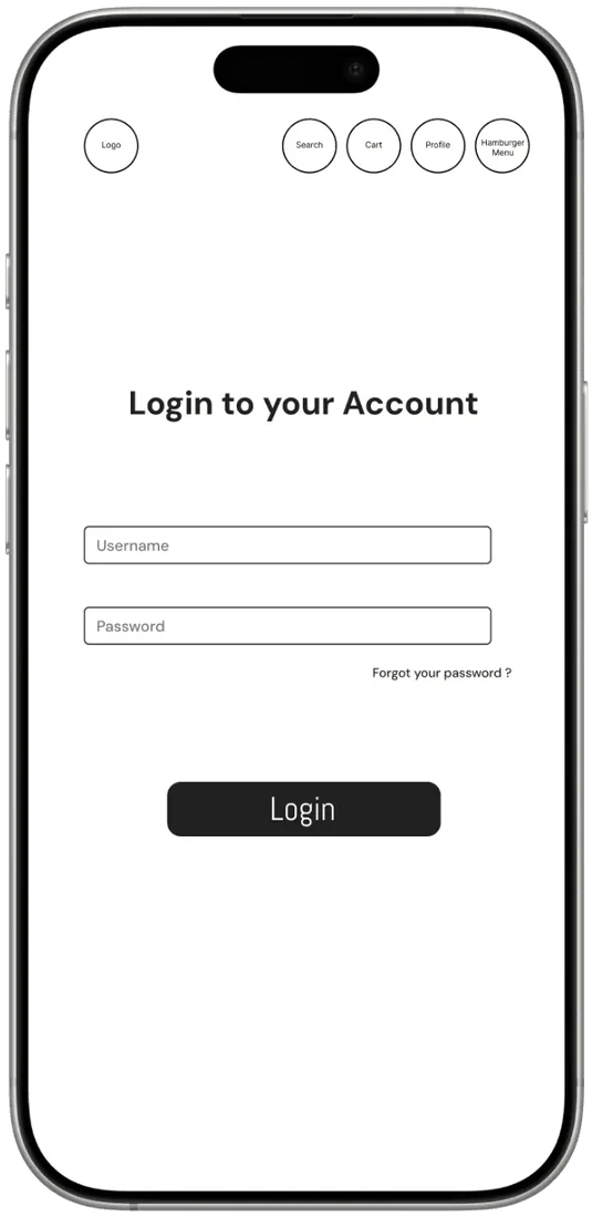
Low-fidelity wireframes mapped the core screens, information architecture and flows before any visual direction. Keeping styling minimal let me focus on structure, navigation and content hierarchy, and catch layout problems early, while they were still cheap to fix.

Lo-fi home
Home
Lo-fi about us
About us
Lo-fi collection
Collection
Lo-fi product details
Product
Lo-fi cart
Cart
Lo-fi login
Login
Lo-fi checkout
Checkout

Style guide

With the structure validated, I built a style guide so every hi-fi screen shares the same type, colour and components. The palette keeps the bakery's pinks and adds a deep plum for contrast, so text and buttons stay readable.

#BFAEC6
#C0589D
#E75B96
#DE84A9
#38053D
#E9E7E6
#997688
Mood board · soft pinks, handmade details, boxed for delivery
v.
Usability testing & iteration

Five people, three targeted fixes

Participants browsed products, found allergen information and checked out in the prototype, using Lyssna.

5/5found the navigation intuitive and easy to follow
3/5asked for a “Continue with Google” login for faster access
2/5hesitated on the product page before adding to cart

Participants called the checkout simple and straightforward, and wanted to see how many items were in the cart at all times.

Continue with GoogleAdded a Google sign-in option to cut friction at account creation, the change participants asked for most.
Cart counterAdded a persistent item count on the cart icon, so people always know what's in their basket without leaving the page.
Product pageRefined spacing and moved the calls to action after two people hesitated before adding items to the cart.
vi.
Hi-fi screens

The whole app

Scroll sideways; tap a screen to enlarge it.