UX/UI case study · Kimiya Sadjadian

Every founder started somewhere.

LilPreneur is a story-driven business game where kids aged 7–12 run their own lollipop stand. Every choice they make, from price to location to what to do when the lollipops start melting, changes what happens next. I designed the experience end to end, from the first phone wireframes to the tablet screens families are testing now.

Web app · tablet-first Kids 7–12 + parents In beta testing
My role
UX/UI designer: flows, wireframes, hi-fi, landing page
Team
2 designers · 4 PMs · 9 engineers & data scientists
Timeline
Aug–Oct 2026 · PM Accelerator
Tools
Figma, Google Drive, Descript, Higgsfield
i.
The problem

Kids want to be the boss. Nobody lets them practice.

76%of Gen Alpha kids (8–14) say they want to be their own boss
78%of surveyed parents say no financial teaching happens at home
2.2/5how easy parents find it to locate good resources
90%of parents call entrepreneurial skills essential; 90% say their child has never been taught them

Sources: Visa Gen Alpha research 2023 (cited in the team's Demo Day deck); team parent survey (n = 10) and PRD.

Stuck between worksheets and Roblox

Existing options sat at two extremes. Worksheets and school programs teach real concepts but lose a kid's attention. Tycoon games hold attention for hours but teach nothing that transfers. Kid debit cards like Greenlight teach spending, not earning.

LilPreneur takes the pull of a game and ties every decision to one real money concept. The kid plays; the playing is the lesson.

“Kids have endless hustle ideas, but adult business advice reads like an MBA textbook. My son gets overwhelmed by financial terms and gives up after 2 days.”Parent post found during discovery, r/Entrepreneur
Learning depth → Business agency →
ii.
Research

We asked before we built

Voice-of-customer interviews, personas, a scan of 50 real kid founders, and my own research on how 7–12-year-olds handle risk and failure.

42 people, four bets

Before the developer pitch on Aug 18, the PMs interviewed 20 parents and 22 kids. Kid sessions were run with a parent present, which mirrored the product's own safety stance. The team framed the work as four connected bets, each with its own test.

My research: boys 7–12, and their parents

Jennifer and I split the kid research by age band (7–9 and 10–12). I took boys: how they ask for help, react to failure and feedback, build confidence, and take risks. I also researched what parents of boys want, and what makes a parent trust a learning app. Peer-reviewed backing came up as the biggest trust factor, which shaped how the landing page talks about safety and real founders.

H1 · Comprehension

Reasoning out loud beats a static tip

86% of kids: more engaging
H2 · Parents

Proof of learning sells, not promises

78% of parents interested
H3 · Retention

Curiosity brings kids back, more than badges

Strong signal, piloting
H4 · Content

AI can draft kid-safe guidance offline

Tested by data science

Who we designed for

Maya, 9Elementary player. Storybook feel, audio and pictures over text.
Diego, 12Middle-school player. Ready for real numbers and harder trade-offs.
Priya, 38The buyer. Not an entrepreneur herself, wants proof her child is learning.
Grandma Ruth, 64Gift buyer. Needs a simple, trustworthy purchase.
Angela, 41Homeschool parent. Needs something she can document.

Personas built from the team survey (n = 10 parents, n = 6 kids) plus stated assumptions.

iii.
How the game works

One day at the stand, eight decisions

Level 1 is a single day running a lollipop stand, modeled on Alina Morse, who started Zollipops at 7.

ParentSign up & fundSets a play wallet, like a first investor
KidAvatar & storyBuilds a look, meets Alina's real story
Decide ×8Plan the standQuantity, flavors, buy or make, location, team, price, sign
PlayRun the dayCustomers, one real-world problem
ReflectResults & badgesProfit or loss, 3 quick questions, save or reinvest
ParentReport by emailChoices, results, questions to ask at dinner
Kid drivesParent drives

Numbers come from rules, not AI

A key safety call shaped every screen: no live AI ever talks to a child. All outcomes come from a fixed set of formulas, so the same choices always give the same result. AI only works after the session, server-side, to pick badges and write the parent report, and a separate model checks that text before anyone sees it.

For design, this meant every choice had to be a clear, finite option. No typing, no open questions, and no number a 7-year-old has to calculate.

How a choice becomes customers

Near School + Afternoon2.00× traffic
Busy Center + Evening1.60× traffic
Put up a sign1.30× traffic
Front Yard (any time)0.80–1.10×
Near School + Evening0.30× traffic
During play

Deterministic engine

  • Fixed traffic, price and cost rules
  • Replayable from a seed
  • Zero model calls
After the day

Session log

  • Every choice and outcome
  • Saved as evidence
Server-side only

AI evaluation

  • Badges against a rubric
  • Parent report draft
  • Checked by a judge model

Every choice is visible in the scene

The stand is built from stacked layers, and each decision swaps one of them. Pick the park and the background changes; add a sign and it appears on the cart; a heat event tints the whole scene. Kids see cause and effect before they read a single number.

The layering also kept the art manageable. Quantity × flavor × wrapper × location × weather would otherwise mean thousands of hand-made scenes.

L6
ScoreboardWallet and stock, updates after every choice
L5
Crowd & reactionsCustomers walk up, react, buy or leave
L4
EnvironmentLocation backdrop, weather overlay
L3
BrandingSign and name on the cart
L2
Product lookFlavors, add-ons, wrappers
L1
Stand setupHow full the cart looks
iv.
Process

Ten weeks, three rounds of design

From a 24-screen phone kit, to annotated decision flows, to a tablet experience built around one living scene.

PRD skeleton & personasMoSCoW scope for a 6-week build
Phone UI kit24 screens, parent sign-up to report
Developer pitchRecruiting the build team
Annotated wireframesDecision flows with design notes
Hi-fi tablet flow140 frames by Sep 15
Alpha sign-ups openFounding families register
Demo DayWorking app presented
Testing & fixesBeta set for Oct 20

Filled markers are the design milestones I led.

Round 1: the phone UI kit

The first pass mapped the whole journey on a phone: account, plan, payment, wallet, avatar, business, story, difficulty, decisions, results and a parent report. It was thorough, but it put seven setup screens before a child ever played.

Round 2: annotated decision flows

I rebuilt the core gameplay as wireframes with a design note on each frame, such as “options slide up as the line finishes” and “badges land before the reinvest question so a loss still ends on something earned.” These notes became the shared language with PMs and developers.

Round 3: one living scene, on a tablet

Kids play on tablets and laptops, often next to a parent. So the hi-fi flow moved to a 1160 × 764 landscape canvas, with Jennifer's illustrated stand at the center and the child's own avatar in every scene. The rest of this page walks through each screen's evolution.

Five rules I designed every screen around

Think first, then chooseThe avatar voices the question in first person; options appear when the line ends.
Audio teaches, text backs it upNarration plays automatically for kids who read slowly.
No grading mid-gameConsequences show at the end of the day, so they feel earned.
End on a winBadges arrive before the money question, even on a losing day.
Show it in the worldEvery choice changes the scene, not just a number.
v.
Screen by screen

How each screen evolved

Scroll each strip from the first sketch to the version in the app. Tap any screen to enlarge it.

01 · Parent onboarding

From seven setup screens to two

The first kit asked parents to create an account, add a child, pick an age route, fund a wallet, choose a plan, pay and confirm before the child saw anything. I cut it to a welcome screen that shows what the child will learn, a two-field sign-up, and one shared profile screen.

Round 1Account
Round 1Age routing
FinalWelcome
FinalSign-up
What changedPlan and payment became a separate parent flow, off the child's path. The beta is free, so nothing stands between sign-up and play.
WhyEvery extra screen before play is a chance for a parent to drop off. The welcome screen now sells the learning in one glance.
Age, simplifiedThe “Elementary vs Middle School” route became a plain age picker. One product serves 7–12; age only sets the starting level.
02 · Profile & avatar

One screen, two people

The avatar is the child's identity for the whole game, so it had to feel like theirs. Early versions used four preset characters. I moved to a mix-and-match builder, then joined it with the parent's profile form on one split screen.

Round 1Presets
Round 2Builder
FinalSplit profile
Two users, one screenThe child builds a look on the left while the parent types on the right. Sitting together is the expected setup moment.
RepresentationA range of skin tones and a hairstyle carousel, so more kids can see themselves at the stand.
Trust detailThe balance carries a “Simulated” tag and the line “No real money charged,” answering the first parent worry right where it comes up.
03 · Business & founder story

A real kid's story before the first choice

The game opens with Alina Morse, who started Zollipops after being told candy was bad for her teeth. In the first kit her story was a text list. I turned it into a narrated, illustrated flashcard sequence, with audio as the main delivery and text as a fallback.

Round 1Story list
Round 2Narrated beat
FinalChoose a business
One beat at a timeFour short cards (the spark, the start, the struggle, the scale) instead of a wall of text. Kids can skip at any point.
No dead endsThe lemonade cart and cookie booth show as “Coming Soon,” so kids see what's ahead without tapping into nothing.
Real stories onlyFounders' photos weren't used, for privacy. Their stories are retold with illustrations.
04 · Make your lollipops

Watching the cost add up

The first real money decision: how many lollipops, which flavors, and whether to buy them or make them. Making them unlocks a creative step, where kids pick an add-on and a wrapper and name their product.

Step 1Quantity & flavor
Step 2Buy or make
Step 3Recipe
FinalMake it yours
Cost you can seeEach add-on shows its cost per pop, and the wallet in the corner updates as the kid picks. No arithmetic needed.
OwnershipThe lollipop preview changes with every choice, and the name the kid types appears on it. It becomes their product.
Cut along the wayAn earlier “pack the shopping list” step and two pop-ups were removed. They added taps without adding a lesson.
05 · Location & time My redesign

The screen the team builds against

Where and how long to sell decides how many customers come by. The first hi-fi version stacked location, time of day and duration in one long scrolling page. I rebuilt it as a single scene: the avatar asks the question, location cards carry a plain trade-off, and the chosen spot fills the background. The file marks the older build as replaced by mine.

Round 1Location list
Round 2Think, then choose
FinalMy version
One screen, no scrollLocation and duration fit in one view at 1160 × 856. The earlier build needed scrolling to reach the button.
Trade-offs, not answersEach card names a cost and a benefit (“Tons of foot traffic, but noisy”) with a short tag. There's no right answer to guess.
Fewer choices at Level 1Time of day left this screen. Evening and paid spots are Level 2–3 skills; weather became a surprise during the day instead.
06 · Your team

Sharing the work, or the profit

Kids choose to run the stand alone, get free help from family, or split the profit with a friend. The lesson is real: family help costs nothing, a partner costs half. The helper then appears in the scene beside the avatar.

Round 1Teammate list
FinalIn the scene
No hidden right answerAn early build ranked “Family” as best and secretly penalized going solo. Rankings were removed; each option is a real strategy.
Honest consequencesThe hidden timer penalty became a visible rule: two people can serve more customers when it gets busy.
From testingTesters said the teammate felt cosmetic. The fix in progress: the helper actually serves customers.
07 · Price & sign My redesign

The Goldilocks price, on the cart

Price is where the core lesson lives: too low and you don't make enough, too high and nobody buys. I explored a slider in the wireframes, then designed the shipped version around the stand itself, with the price card written on the cart. The file names this “the original Kimiya cart version.”

Round 1Presets
Round 2Slider
FinalMy cart version
Whole dollars7–9-year-olds haven't mastered decimals, so prices are $1, $2 and $3. Level 3 adds cents later.
Set expectationsA small note says the price is locked for the day, which matches how the engine works.
Cause and effectThe price board on the cart updates live, and choosing a sign shows one on the stand.
08 · Run your stand

From placeholder to a living street

The payoff screen. Earlier wireframes showed a fixed HUD with price, sold and left counts under a placeholder scene. The final version plays out in the illustrated scene: customers walk up, a speech bubble narrates, and money floats up on each sale. A few customers stop to ask a question.

Round 1Placeholder
FinalCustomers
FinalConversation
Kind, not gradedEarly drafts let a kid be rude to a customer. The final asks a helpful question with a clear vs. vague answer, without a moral test.
Labels carry the hintEach answer has a short consequence tag (“Customers love knowing what they're getting!”) instead of a score.
From testingAt 30 lollipops, one-by-one customers got slow. Level 1 now caps full conversations at 3; the rest arrive in groups.
09 · A real-world problem

One surprise, two fair answers

Every day brings one problem real kid founders faced: heat that melts lollipops, a sudden rainstorm, or fog that hides the stand. The first sketch had three options, including “pack up and go.” The final gives two fair answers, each with a visible trade-off, and the problem tints the whole scene.

Round 1Story event
FinalHeat
One template, many problemsHeat, rain and fog share a layout: an orange alert header, the tinted scene, and two choice cards with icons.
Neither answer is wrongA free fix with a downside versus a fix that costs money. That trade-off is the lesson.
Growing the bankNew events for older players are in review, like a rival stand selling at the same price.
10 · Results & badges

End the day on something earned

The kid sees a receipt-style summary of the day, a recap of all eight decisions, and three badges. Badges land before the money question, so even a losing day ends with a win. Then the kid decides: save the earnings, or spend on next time's stand.

Round 1Money choice
Round 2Badges first
FinalDay receipt
FinalBadges
Simpler money words“Invest in a new business” became “spend on next time's stand.” “Reinvest” is a Level 2 word.
The receiptRevenue, minus expenses, equals profit, in a format kids already know from a store.
Next: replay or level upI'm designing the screen that follows: replay this level, or move up to Level 2.
11 · Parent report

Proof of learning for the buyer

Research showed parents pay for proof their child is learning. After each session, an emailed report lists the child's decisions, the money math, and questions to ask at dinner. The report pages keep every session in one place.

Round 1Analysis
FinalReport list
FinalSession detail
Plain languageWritten for a parent, not an accountant. Each decision links to the concept it practiced.
Conversation startersQuestions like “Was $2 the right price?” keep the lesson going at home.
Calm by designNo real-time alerts. Parents get one summary after each play, plus a history of past sessions.
vi.
Badges

Rewarding good thinking, not luck

Four badges a child can earn in a Level 1 day, each tied to a skill the game teaches.

How a badge is earned

Badges are never handed out mid-game. After the day ends, every choice and outcome is saved to a log, and that log is checked against a fixed rule for each badge. A child earns a badge for a pattern of decisions that work together, so a lucky day alone doesn't earn one.

Badges appear on the Level Complete screen before the money question, so even a day that loses money ends on something earned. They also show up in the parent's report, as evidence of what the child practiced.

1Kid plays the day8 decisions + 1 surprise
2Choices loggedSaved after the day ends
3Rules checkedOne fixed rule per badge
4Badge revealBefore the money question

The Level 1 set

Locked · replay to unlock

Smart Planner

For the kid who thought through cost and price before opening.

  • Made the lollipops instead of buying them
  • Set the target price margin (15%)
  • Put up a sign
  • Ended the day with a profit
Teaches: planning
Locked · replay to unlock

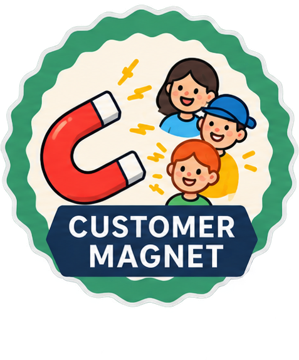
Customer Magnet

For the kid who went where the people are and let them know.

  • Picked the best spot and time
  • Put up a sign
  • Served at least 5 customers
Teaches: demand
Locked · replay to unlock

Super Seller

For the kid whose stock and helpers matched the crowd.

  • Had a helper at the stand
  • Turned no customers away
  • Sold every lollipop
Teaches: supply & capacity
Locked · replay to unlock

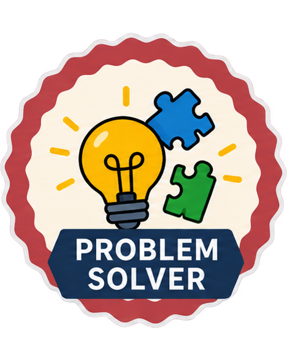
Problem Solver

For the kid who handled the day's surprise and kept going.

  • Responded to the heat, rain or fog
  • Still sold lollipops
  • Still made a profit
Teaches: resilience

Rules as written in the build's badge logic and the team's testing guide. The margin rule is exact: 14% or 16% does not earn Smart Planner.

How the badges evolved

First set
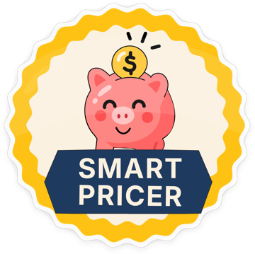
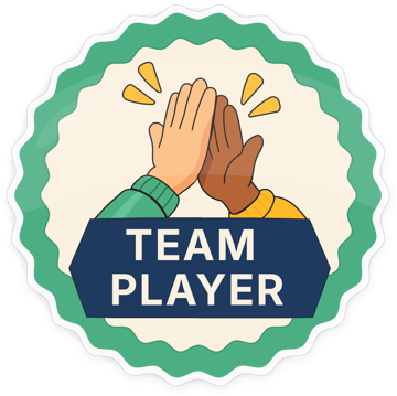
Team Player badgeRisk Taker badgeSmart Pricer badge

Team Player, Risk Taker and Smart Pricer, used on the first Level Complete screen. They named traits, but not the decisions behind them.

Names a 7-year-old can read
First SaleStorm FixerCrowd FinderSign Star

Adult-sounding names like “Risk Manager” and “Savvy Sourcer” moved to Level 3. For Level 1 the team explored names that describe a moment. A badge a child can't understand doesn't motivate them.

Today: one rule, one picture

Testing found two badges sharing the same picture, and a third borrowing an old one. The fix: one picture per badge, plus a locked version.

From testing: show what's still locked

The first build only showed the badges a child earned. Testers suggested showing the locked ones too, with a line like “2 more badges waiting, replay to unlock?” That turns the badge row into a reason to play again. Use the toggle above to see the locked state.

More in the collection

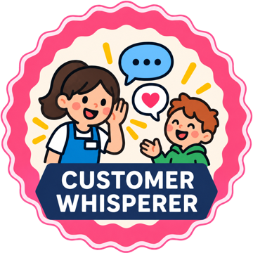
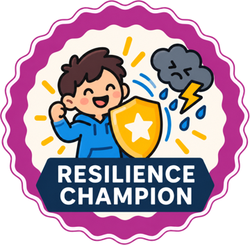
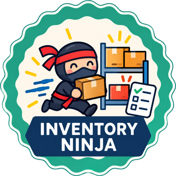
Customer Whisperer badgeResilience Champion badgeInventory Ninja badge

Customer Whisperer, Resilience Champion and Inventory Ninja appear on the landing page, showing parents the kind of skills the badge collection grows into.

vii.
Words are UI

Every word checked against the age

The data science team built a four-tier vocabulary map. Every word a child sees or hears is checked against it.

For a 7-year-old, swapping one word can matter more than any layout change. Level 1 introduces only two business words, profit and loss. Everything else is said in plain terms, and the formal word is introduced in later levels.

Draft wordingWhat kids see at Level 1Why
AdvertisingLet people knowTier 2 Abstract business term, blocked at Level 1
ReinvestPut money back into the businessTier 2 Scheduled for a later level
Discount melting stockSell melting lollipops for a lower priceKids this age don't work with percentages; “stock” could mean soup
Save / bank itSave itThere's no bank in the game, only a wallet
Grown-ups call this timingPicking the right time and weather can bring more customersFocus on the concrete choice
PersuasionYou helped that customer find a flavor they love!Kept as an internal design term only

Source: PRD & UI vocabulary fixes, Business 1 vocabulary tier spec.

viii.
Landing page

Designing for the parent who buys

The app speaks to the kid. The landing page answers the parent's two questions: is it safe, and will my child actually learn?

I designed the page in Figma from my own mockups. I kept a master page and explored three full-page versions, because the first features row felt crowded and the accordion FAQ felt stale. Version A put a full-bleed family photo behind the hero with the navigation floating on top, which is how the live page opens.

The page moves from a one-line promise, to real kid founders, to a “how it works” video, to perks for parents, to a safety block that says it plainly: no chatbots, no strangers, virtual money only.

I also made the video content: a short explainer for the hero in Descript, and a 30-second story video in Higgsfield. Its speech bubbles use exact spelling so kids who are hard of hearing can follow along.

Visit lilpreneur.co ↗

ix.
Design system & handoff

Warm, clear, never babyish

I created the brand sheet and applied it across every screen. Jennifer drew the illustrations that bring it to life.

Marigold
#F2A118
Buttons, selected, celebration
Sage
#63A18B
Money, progress, simulated
Ink Navy
#0E2A5C
Headings, text, dark surfaces
Cream
#FDF8F0
Page ground

One contrast rule shaped every button

Navy text on marigold reaches 6.3:1 contrast. White on marigold drops to 2.1:1 and fails. So every orange button in the app uses navy text.

Continue 6.3 : 1 ✓ Continue 2.1 : 1 ✗

I set the type pairing too: PT Serif Bold for headings, Inter 400/600 for everything else. A colleague described the early UI kit as approachable and fun, without feeling dumbed down for kids.

Handoff without a click-through prototype

By mid-September the Figma file held 140 frames. Instead of wiring a prototype, the team mapped every scene to its live frame, art folder and open questions in a handoff tracker. Older versions are labeled “superseded” so developers build only the live one.

We also pushed to build one componentized scene with team and weather as variables, instead of separate copies of the run-your-stand sequence for each helper.

x.
Testing & feedback

Families are playing it now

The working app was presented at Demo Day in early October. The free beta is planned for Oct 20.

65+founding families signed up to test
75+kids ready to play
3educators enrolled as beta testers
40+voice-of-customer interviews

How we're testing

Before families play, each team member owns part of the app in user acceptance testing. My area is the first impression: the website, sign-up and setup, the avatar, the business story, and the first decision screens. The checks: does it look polished, is it friendly, and is it easy for a child's hands and eyes on a tablet.

We also watch children play with a parent's consent, without helping, and note where they hesitate, laugh or get stuck. Each playthrough is scored with a skills rubric covering cause and effect, trade-offs and managing risk, so we measure learning, not just clicks.

What the sign-ups told us

The sign-up form asked parents their child's stage (7–8, 9–10 or 11–12) and which skill to master first: pricing, bouncing back from failure, spotting opportunities, or weighing trade-offs. Most parents picked all four. Their answers to “what do you wish schools taught?” clustered around money management and real-life projects.

Feedback so far, and what we're changing

xi.
What I learned

Designing for a 7-year-old and their parent at once

Two users, one screenThe kid and the parent want different things from the same moment. Splitting the profile screen solved it better than separate flows.
Words are design“Let people know” instead of “advertising” mattered as much as any layout. I learned to treat the vocabulary list as a spec.
Constraints helpNo live AI and no typing pushed me toward clear, finite choices a 7-year-old can actually make.
Keep the file honestWith two designers moving fast, labeling superseded work kept developers from building the wrong screen.
The team
DesignKimiya Sadjadian (UX/UI)
Jennifer Robertson (graphics & illustration)
ProductShivani Tetali, Sai Gutala, Chong Zhao, Sathya Pathiban
EngineeringThree front-end and three back-end engineers
Data scienceThree data scientists: engine, vocabulary, evaluation