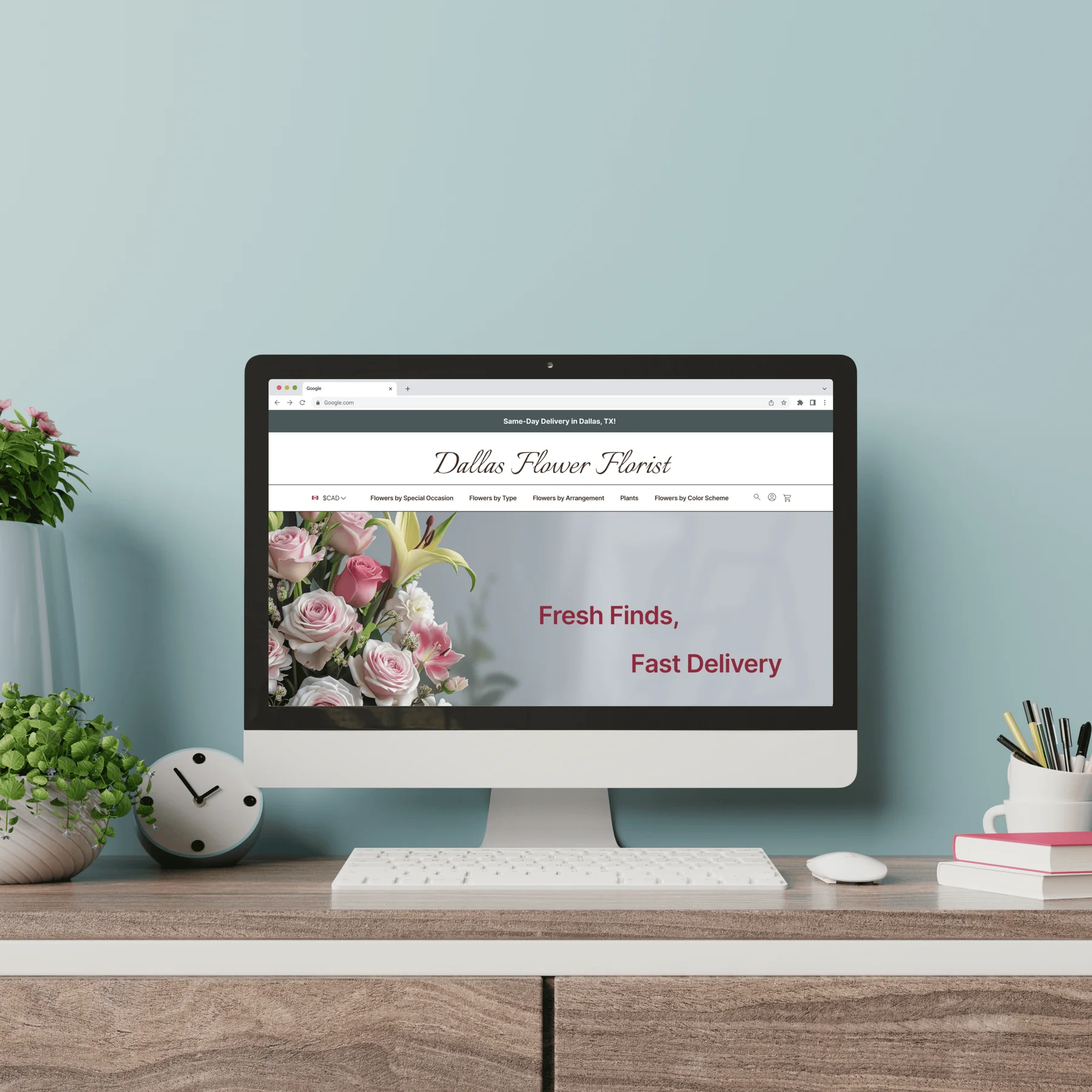
Delivery information made prominent and scannable, strong product photos, and complete descriptions on every listing.
Handcrafted bouquets deserve a shop this easy to order from.
A long-established local florist with a loyal community, held back by a website that made browsing and ordering hard. We redesigned it from a heuristic evaluation through to a tested, iterated hi-fi prototype.

Dallas Flower Florist is known for handcrafted bouquets, personalised arrangements and thoughtful service, for everyday moments as well as special occasions. Its website didn't live up to that reputation.
Unclear navigation, inconsistent information and an outdated interface made it hard to browse, compare options and buy with confidence. The site had no cohesive structure or intuitive flow.
Organized, modern and easy to navigate, building confidence from the first visit to checkout.
Before any user testing, we reviewed the existing site against usability heuristics. Each finding became a design decision.
Four activities to validate our assumptions and hear from users directly.
We compared Dallas Flower Florist with four major floral e-commerce sites to learn the standards for product presentation, navigation and checkout, and to see where better usability and clarity could set the shop apart.
| Feature | Dallas Flower Florist | 1-800-Flowers | FTD | ProFlowers | UrbanStems | Recommendation |
|---|---|---|---|---|---|---|
| High-quality images | ✕ | ✓ | ✓ | ✓ | ✓ | Keep high-quality images consistent |
| Detailed descriptions | Basic; could use more detail | ✓ | ✓ | ✓ | ✓ | Add more product detail |
| Customer reviews | ✕ | ✓ | ✓ | ✓ | ✓ | Add a review system |
| Real-time stock | ✕ | ✓ | ✓ | ✓ | ✕ | Show real-time stock |
| Delivery information | ✓ | ✓ | ✓ | ✓ | ✓ | Make delivery times and options more visible |
| Customization | ✓ | ✓ | ✓ | ✓ | ✓ | Expand customization |
| Customer support | Contact info, but no quick access | ✓ | ✓ | ✓ | Chat and email; no phone | Add 24/7 live chat |
| Search | Basic categories, no advanced filters | ✓ | ✓ | ✓ | Simple search, limited filters | Improve search |
The survey challenged some of our early assumptions and gave us clear, data-backed priorities.
Delivery information made prominent and scannable, strong product photos, and complete descriptions on every listing.
Occasions became the main way to browse, with colour and size as secondary filters.
We assumed people buy one bouquet and want to check out straight away. They don't. A subtle confirmation now keeps them on the page.
Survey of 21 respondents (20 for finding 3).
A card sort showed how people naturally group floral products: by occasion (birthdays, weddings, sympathy) rather than flower type. It confirmed the survey and set the navigation and category labels in our new sitemap.
From the survey and card sort we built Jessica Nguyen, a marketing coordinator in Toronto who sends flowers to loved ones in Dallas. Her scenario became the path we designed and tested.
We tested version 3 with users, and their findings shaped version 4, our last mid-fi before hi-fi.
With the needs and structure clear, we sketched layouts to try different content arrangements and settle the basic structure of each page before wireframing.
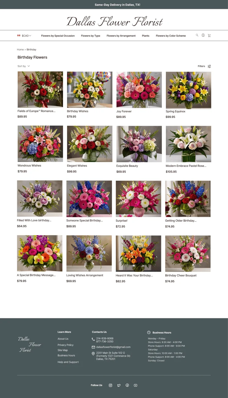
We made two hi-fi versions to compare styling and settle the UI patterns. Here's the final one, following the scenario. Scroll inside the browser window.